An Onboarding Journey
Rebuilding Motivation in the Onboarding Experience
This study is a comprehensive case study conducted to optimize the onboarding process—the very first point of contact between a complex SaaS platform and its users.
The Challenge & Analysis
Onboarding is a critical threshold where a product "shakes hands" with its user and must prove its value proposition. My primary goal in this project was to transform technically mandatory complex steps into a fluid experience that avoids user fatigue and keeps motivation consistently high.
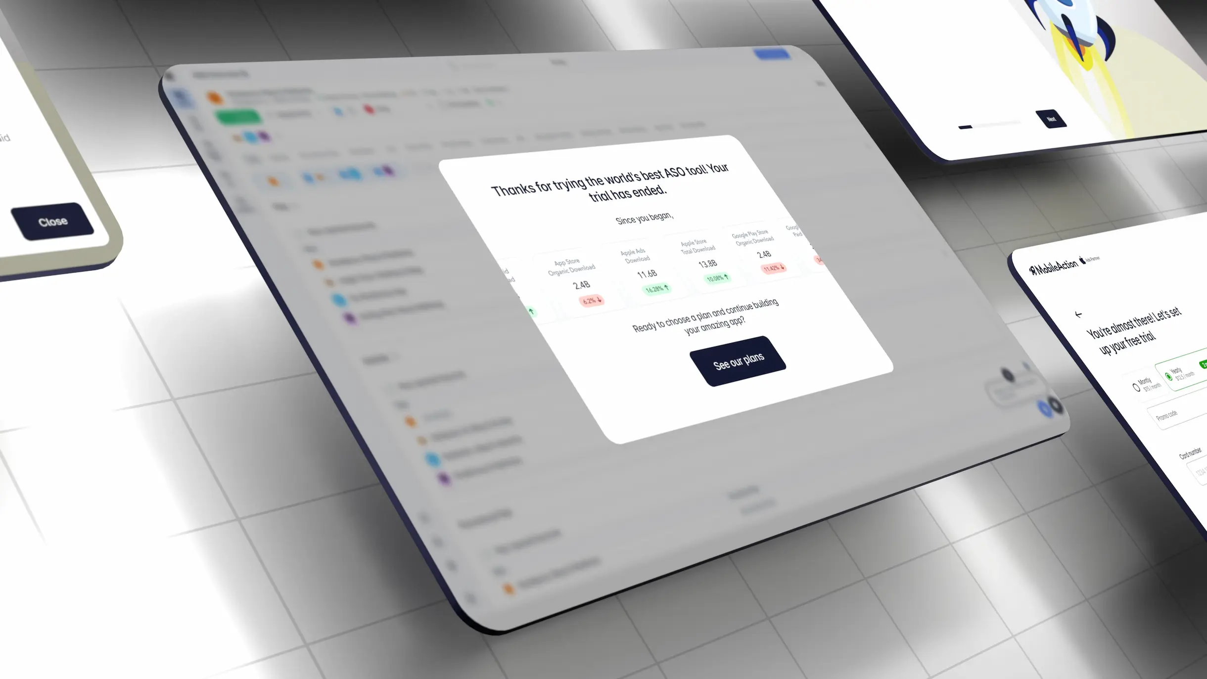
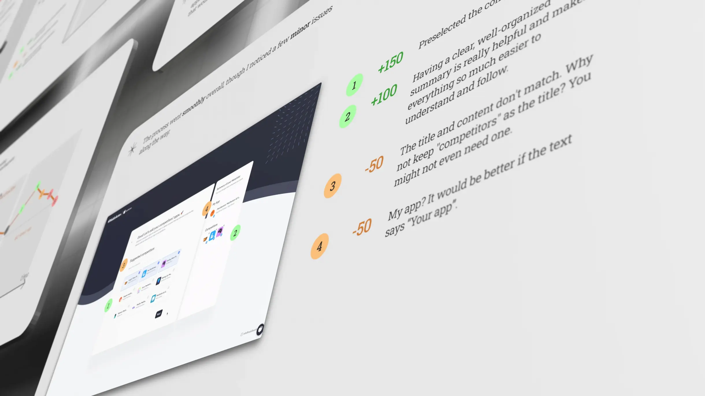
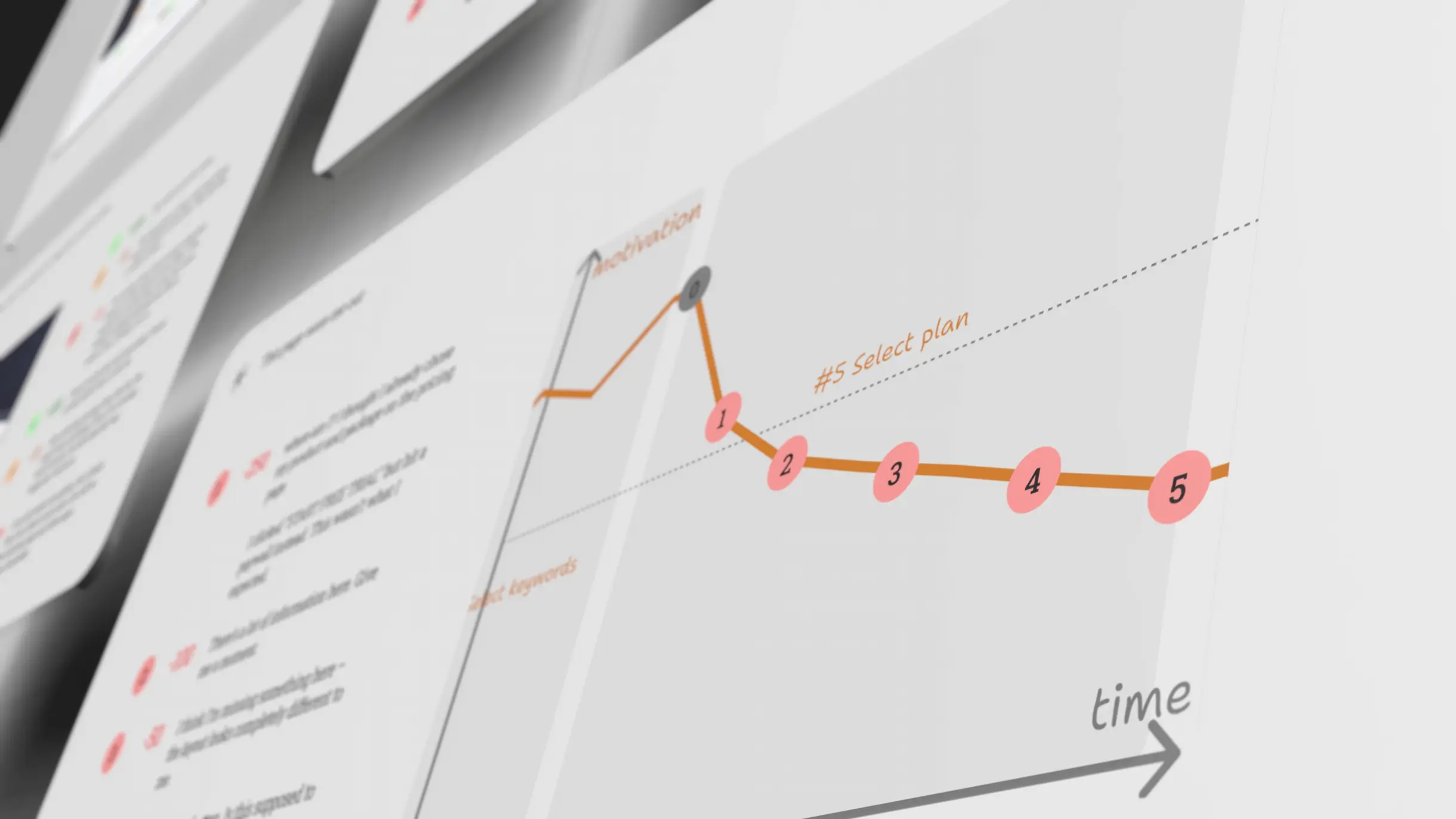
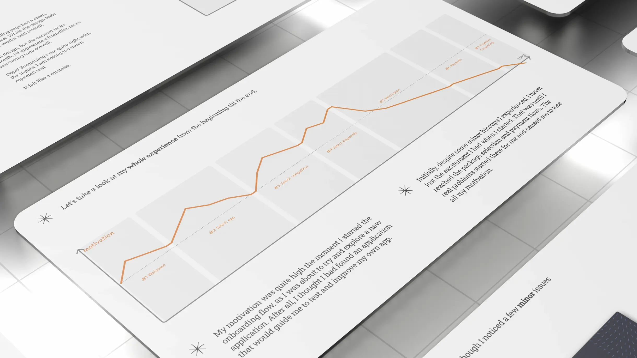
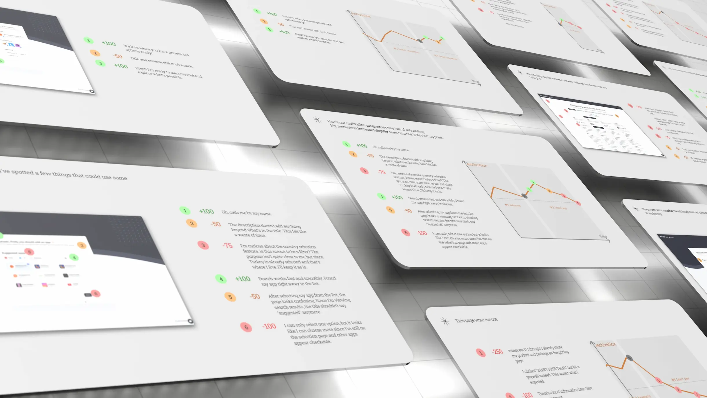
Before starting the design process, I experienced the current platform's onboarding flow as a user and recorded every step. During this 7-step process, I assigned a rational motivation score to each interaction. My analysis revealed that while user motivation rose initially due to "personalization," it suffered a dramatic drop starting from the 5th step when faced with complex plan selections and the "paywall." Being forced into a payment commitment before even trying the product emerged as the most significant friction point.
Strategy & Solution
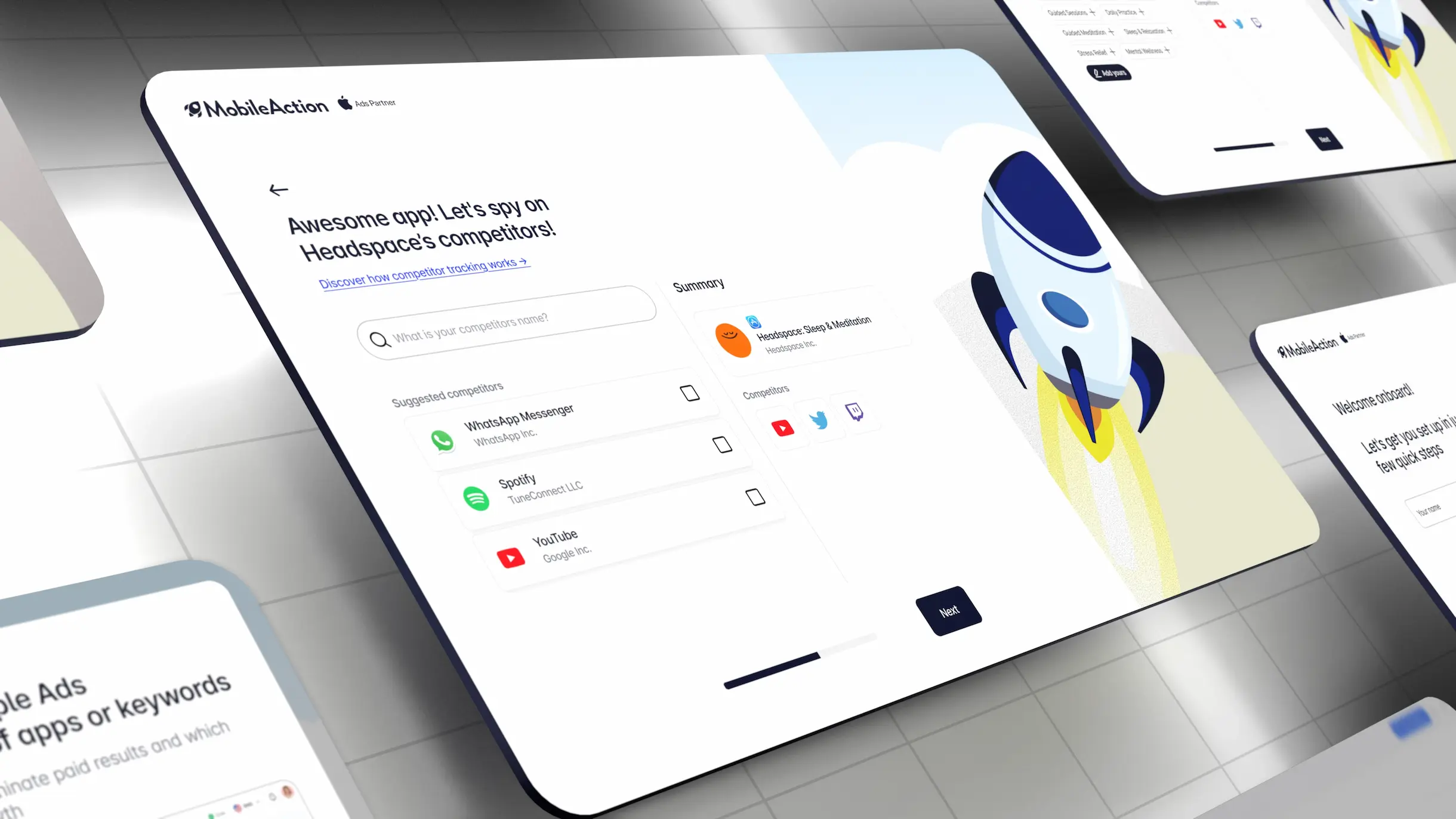
I built my strategy on "Conversational UI" by restructuring the information architecture, I
followed these steps:
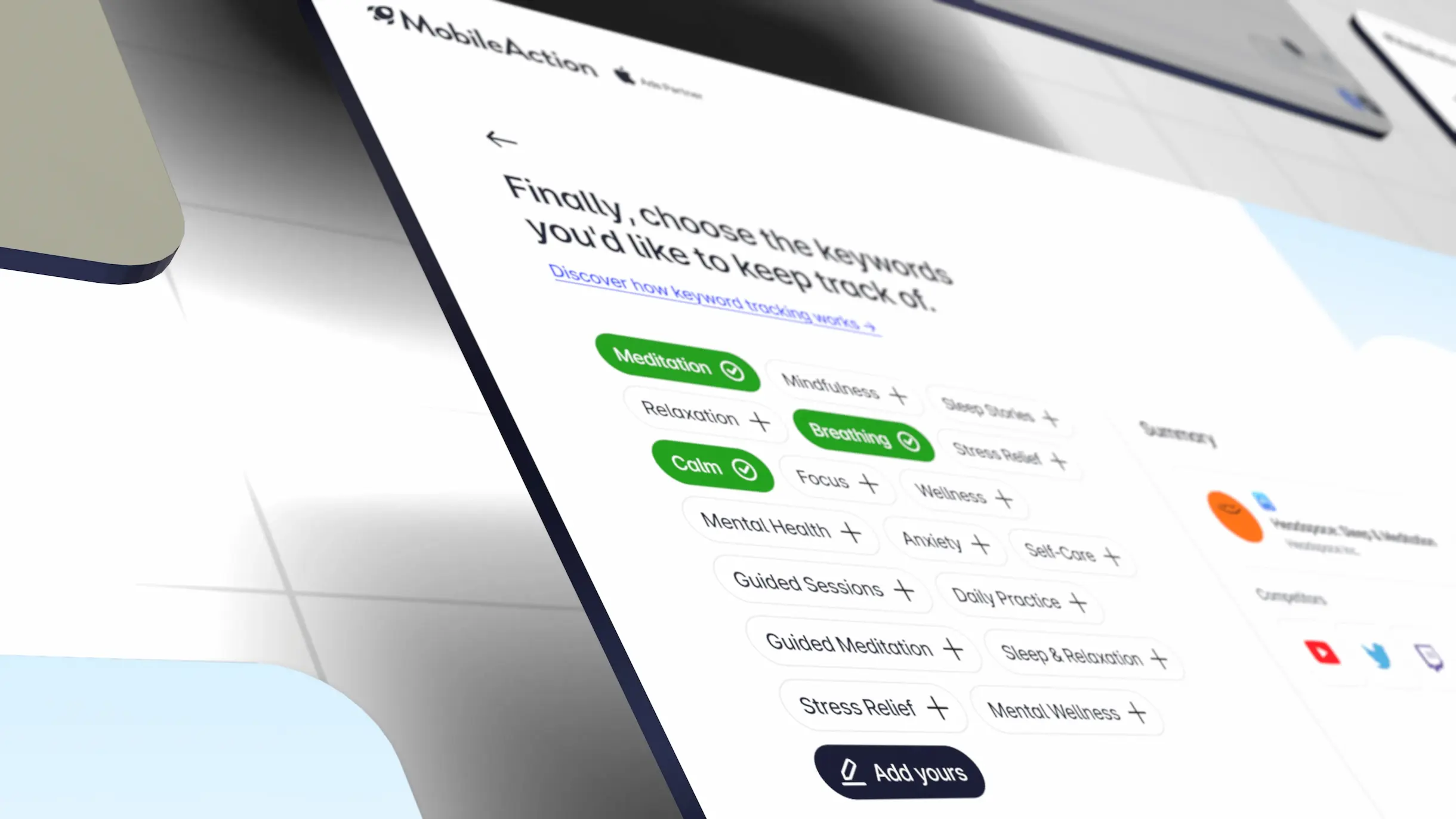
- Cognitive load: I broke down complex data entries into smaller parts, allowing the user to focus on a single decision at a time.
- Transparency and guidance: I added progress indicators to show users where they were in the process and replaced technical jargon with more human-centric, guiding copy.
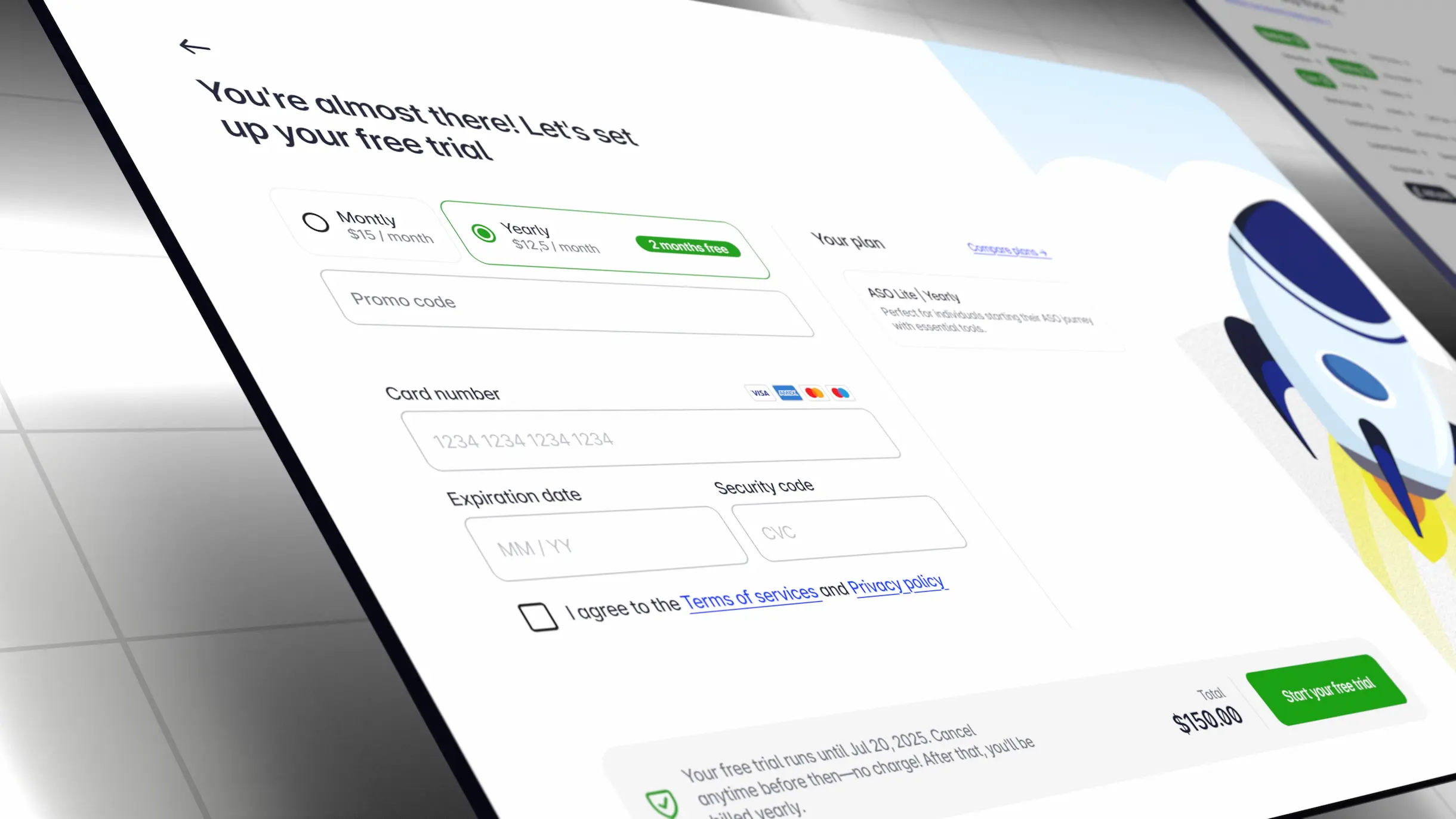
- Loss aversion: Instead of forcing the user to pay immediately, I integrated "freemium" or "trial-first" approaches that showcase the product's benefits upfront.
Design & Implementation
During the redesign process in Figma, I merged aesthetics with functionality on a rational
basis:
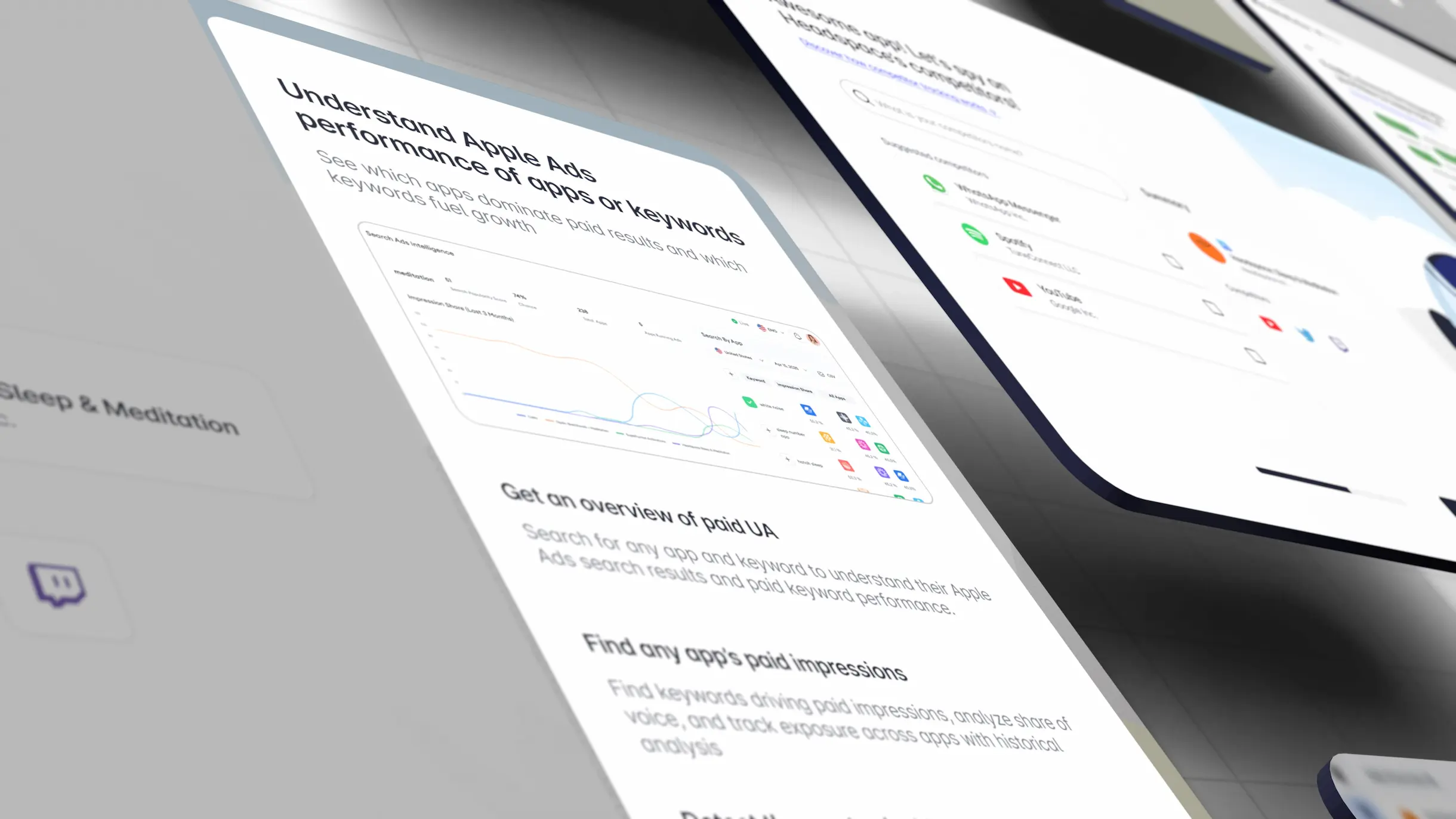
- Visual language: Abandoning traditional and static layouts, I developed a high-contrast, dynamic, and modern interface language.
- Form optimization: I streamlined form fields by approximately 40%. I designed "fast-track" paths that allow users to reach the dashboard directly in certain scenarios.
- Accessibility: I standardized everything from the color palette to font choices to ensure readability across all devices and lighting conditions.
The Result
At the conclusion of the study, I achieved a flow that increased user motivation by approximately 60% compared to the baseline. My biggest takeaway from this project was reaffirming that design is not just about "beautifying" but about solving problems based on data. By turning the payment step from an "obstacle" into a part of the value offered, I managed to potentially drive up conversion rates.